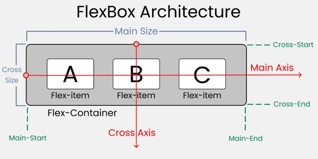
A flexbox container is an element in which the flexible content box is applied. This means that the container can have children that are aligned and spaced in a flexible manner. Flexbox containers can be used to create a variety of layouts, such as rows of elements, columns of elements, and grids of elements.
To create a flexbox container, simply apply the property display: flex to the desired element. This will cause the element to become a flexbox container and its children to become flex elements.
Once you have created a flexbox container, you can use a variety of CSS properties to control how its children are aligned and spaced. Some of the most common CSS properties for flexbox containers include:
justify-contentThis property controls how the children are aligned along the main axis.align-itemsThis property controls how the children are aligned along the secondary axis.flex-directionThis property controls the direction in which the children are aligned.flex-wrapThis property controls whether children wrap to the next line when they do not fit on the current line.flex-growThis property controls how the children in the container are expanded.flex-shrinkThis property controls how the children in the container are collapsed.flex-basisThis property sets the base size of the children.
Using these properties, you can create a variety of different designs with flexbox containers.
Creating complex designs using Flexbox
Using flexbox for a bakery site.
The #nav container justify-content property is set to flex-end, which means that the children of the container will be aligned on the right edge of the container.
The #welcome container has a flex-direction property set to row, which means that the children of the container will be aligned horizontally.
Finally the #footer container has a flex display, a row flex address, a space-around content justification and a center element alignment. This means that the children of the container will be horizontally aligned, evenly spaced and vertically centered.
					#nav {
  background-color: #DE9C51;
  color: #FFFFFFFF;
  display: flex;
  justify-content: flex-end;
}

#welcome {
  background-color: #F0F0F0F0;
  display: flex;
  flex-direction: row;
}

#footer {
  background-color: #30303030;
  height: 50px;
  display: flex;
  flex-direction: row;
  justify-content: space-around;
  align-items: center;
}

.p-1 {
  padding: 8px;
}

.p-2 {
  padding: 16px;
}

h1 {
  text-align: center;
}

a {
  color: #FFFFFFFF;
  text-decoration: none;
}

img {
  width: 100%;
}

body {
  font-family: sans-serif;
}
					<!doctype html>
<html>
  <head>
    <link rel="stylesheet" href="style.css" />
  </head>
  <body>
    <h1>Nonna's Italian Bakery</h1>
    <div id="nav">
      <div class="p-1">Home</div>
      <div class="p-1">Menu</div>
      <div class="p-1">Pasteries</div>
      <div class="p-1">Contact</div>
    </div>
    <div id="welcome">
      <div class="p-2">
        <h2>Welcome!</h2>
        <p>Nonna's Italian Bakery has something for everyone, including breads,
          desserts, gelato, and more.</p>
        <p>Stop in today to see what Nonna's cooking up!</p>
      </div>
      <img decoding="async" src="https://mimo.app/i/bread.png">
    </div>
    <div id="footer">
      <a href="#" class="item">Find Us</a>
      <a href="#" class="item">Order Online</a>
      <a href="#" class="item">Catering</a>
    </div>
  </body>
</html>
Using flexbox to design the layout of a lunch page of the day.
- The container
.containerhas a flex display, a height of 260px, a flex direction of column and a content justification of space-around. This means that the children of the container will be vertically aligned, evenly spaced and horizontally centered. - The container
.footerhas a flex display, a padding of 5px, a flex direction of row and a content justification of center. This means that the children of the container will be horizontally aligned, evenly spaced and vertically centered.
As you can see, the children of each flexbox container are aligned and spaced according to the properties that have been set.
In particular, the container .container has its children vertically aligned and evenly spaced. The container .footer has its children horizontally aligned and evenly spaced.
					.container {
  background-color: #F0F5FD;
  display: flex;
  height: 260px;
  flex-direction: column;
  justify-content: space-around;
}

.footer {
  display: flex;
  padding: 5px;
  flex-direction: row;
  justify-content: center;
}

.item {
  background-color: #D9E8FB;
  padding: 10px;
  text-align: center;
}

h3 {
  text-align: center;
}

a {
  margin: 10px;
}
Helping a French bakery to launch its website with Flexbox.
- The container
.mainhas a flex display, a space-around content justification. This means that the children of the container will be aligned horizontally and spread evenly. - The container
.containerhas a flex display, a space-around content justification and a width of 80%. This means that the children of the container will be horizontally aligned, evenly spaced and have a width of 80%.
In particular, the container .main has its children horizontally aligned and evenly spaced. The container .container has its children horizontally aligned, evenly spaced and with a width of 80%.
					.main {
  display: flex;
  justify-content: space-around;
  color: #994E21;
}

.container {
  background-color: #DE9C51;
  color: #FFFFFFFF;
  display: flex;
  justify-content: space-around;
}

.item {
  width: 80%;
  margin: auto;
  padding: 10px;
}

.nav-item {
  padding: 3px;
  margin: 0 5px;
}

img {
  width: 90%;
  border: 10px solid #FFFFFFFF;
  border-radius: 2px;
}

h1 {
  font-family: Luminari;
  text-align: center;
}

p {
  text-align: center;
  font-weight: bold;
}

body {
  font-family: Verdana;
  background-color: #FBF4F0;
}
					<!doctype html>
<html>
  <head>
    <link rel="stylesheet" href="style.css" />
  </head>
  <body>
    <h1>Le French Bakery</h1>
    <nav class="container">
      <a class="nav-item">Home</a>
      <a class="nav-item">Menu</a>
      <a class="nav-item">Pastries</a>
      <a class="nav-item">Contact</a>
    </nav>
    <div class="main">
      <div class="item">
        <p>Visit the <a href="http://mock.getmimo.com" target="_blank" rel="noopener">restaurant</a> and try
          our french croissants, freshly baked for you every morning.</p>
      </div>
      <div class="item">
        <img decoding="async" src="/img/croissant.png">
      </div>
    </div>
  </body>
</html>
Using flexbox knowledge to style an e-commerce site.
- The container
.wrapperhas a propertydisplay: flex. This means that your children will be displayed in a single row, with the same width. - The container
.nav_items_container__itemhas a propertymargin: 1em. This means that there will be a margin of 1em between each element of the container. - The container
.products_containerhas a propertydisplay: flexand a propertyflex-wrap: wrap. This means that your children will be displayed in a single row, but if there are not enough items to fill the row, they will roll up to the next row. - The container
.product_cardhas a propertywidth: 40%. This means that each product card will occupy 40% of the width of its container. - The container
.product_card__detailshas a propertyflex-direction: column. This means that your children will be displayed in a single column, instead of a single row. - The container
.product_card__addToCart__btnhas a propertycursor: pointer. This means that the button will be clickable.
The CSS code also defines other properties, such as font-family, color, height, padding, y border-radius. These properties are used to control the appearance of the elements.
In general, CSS code uses flexbox to create a flexible and responsive layout. Flexbox containers can be easily resized to fit different screen sizes and flex elements can be easily reordered.
					body {
  font-family: Arial, Helvetica, sans-serif;
  color: #FFF;
}

main,
nav {
  margin: 2px auto;
}

.wrapper {
  background-color: #4D4D4D87;
  height: 900px;
}

.nav_items_container {
  background-color: #4D4D4D87;
  display: flex;
  list-style-type: none;
  justify-content: center;
}

.nav_items_container__item {
  margin: 1em;
}

.products_container {
  padding: 4em;
  margin: 2px auto;
  display: flex;
  justify-content: center;
  flex-wrap: wrap;
}

.product_card {
  width: 40%;
  padding: 10px;
  margin: 1em;
  height: 100px;
  color: #000;
  border-radius: 5px;
  background-color: #FFFFFFFF;
  display: flex;
}

.product_card__details {
  font-size: 14px;
  width: 100%;
  display: flex;
  flex-direction: column;
  justify-content: center;
}

.product_card__addToCart {
  width: 100%;
  display: flex;
  justify-content: flex-end;
  align-items: flex-end;
}

.product_card__addToCart__btn {
  cursor: pointer;
  color: #FFF;
  margin-top: 1em;
  background-color: #4D4D87;
  border-radius: 5px;
}
					<!doctype html>
<html>
  <head>
    <link href="style.css" rel="stylesheet" />
  </head>
  <body>
    <nav class="navbar_container">
      <ul class="nav_items_container">
        <li class="nav_items_container__item">Home</li>
        <li class="nav_items_container__item">Products</li>
        <li class="nav_items_container__item">Specials</li>
        <li class="nav_items_container__item">About</li>
        <li class="nav_items_container__item">Contact</li>
      </ul>
    </nav>
    <main class="wrapper">
      <div class="products_container">
        <div class="product_card">
          <div class="product_card__details">
            <div class="product_card__details--name">Tee Shirt</div>
            <div class="product_card__details--price">$14.99</div>
          </div>
          <div class="product_card__addToCart">
            <button class="product_card__addToCart__btn">Add to Cart</button>
          </div>
        </div>
        <div class="product_card">
          <div class="product_card__details">
            <div class="product_card__details--name">Jeans</div>
            <div class="product_card__details--price">$29.99</div>
          </div>
          <div class="product_card__addToCart">
            <button class="product_card__addToCart__btn">Add to Cart</button>
          </div>
        </div>
        <div class="product_card">
          <div class="product_card__details">
            <div class="product_card__details--name">Sneakers</div>
            <div class="product_card__details--price">$49.99</div>
          </div>
          <div class="product_card__addToCart">
            <button class="product_card__addToCart__btn">Add to Cart</button>
          </div>
        </div>
        <div class="product_card">
          <div class="product_card__image"></div>
          <div class="product_card__details">
            <div class="product_card__details--name">Coat</div>
            <div class="product_card__details--price">$89.99</div>
          </div>
          <div class="product_card__addToCart">
            <button class="product_card__addToCart__btn">Add to Cart</button>
          </div>
        </div>
      </div>
    </main>
  </body>
</html>
Now using the Flexbox style in a blog
- The container
.headinghas a propertytext-align: center. This means that the text inside the container will be center aligned. - The container
.navContainerhas a propertydisplay: flex. This means that your children will be displayed as a flexbox. - The property
flex-direction: rowtells the flexbox to show your children in a single row. - The property
justify-content: space-betweentells the flexbox to distribute its children evenly between the start and end of the container. - The property
align-items: centertells the flexbox to align its children vertically in the center of the container. - The container
#navPhotohas a propertytext-align: right. This means that the text inside the container will be aligned to the right. - The element
ahas a propertycolor: #36454F. This means that the text inside the link will be displayed in the color #36454F. - The container
.headlineContainerhas a propertyheight: 400px. This means that the container will be 400 pixels high. - The property
display: flextells the flexbox to display its children as a flexbox. - The property
flex-direction: row-reversetells the flexbox to display its children in a single row, but in reverse order. - The property
flex-wrap: wraptells the flexbox to wrap its children to the next line if they do not fit on a single line. - The property
justify-content: center
					body {
  margin: auto;
  background-color: #FFF9F5;
  color: #36454F;
  font-family: Arial, Helvetica, sans-serif;
  max-width: 800px;
  min-width: 600px;
}

.heading {
  text-align: center;
}

.navContainer {
  display: flex;
  flex-direction: row;
  justify-content: space-between;
  align-items: center;
}

#navPhoto {
  text-align: right;
  margin: 10px;
}

a {
  margin: 10px;
  color: #36454F;
  text-decoration: none;
}

.headlineContainer {
  height: 400px;
  display: flex;
  flex-direction: row-reverse;
  flex-wrap: wrap;
  justify-content: center;
  align-content: space-around;
}

.headlineImage {
  width: 100px;
  height: 100px;
  border-radius: 5%;
  float: left;
}

.headlineItem h3 {
  margin: 15px 5px 5px 5px 5px 5px;
  text-align: center;
}

.column {
  max-height: 250px;
  display: flex;
  flex-direction: column;
  align-items: center;
}

.colItem {
  width: 95%;
  margin: 8px;
  border: 2px solid #F0EEEEEE;
  border-radius: 2px;
  text-align: center;
}

.navItem {
  width: 220px;
}

#navPhoto img {
  width: 50px;
  border-radius: 50%;
}

.headlineItem {
  height: 100px;
  width: 45%;
  margin: 10px;
  border: 2px solid #C0C0C0;
  border-radius: 4px;
  background-color: #C2C2C2C2;
}

.headlineItem:hover,
.colItem:hover {
  cursor: pointer;
}

.colItem h4 {
  margin: 5px;
}

.colItem p {
  margin: 3px;
}
					<!doctype html>
<html>
  <head>
    <title>JavaScript Journal</title>
    <link rel="stylesheet" href="style.css">
  </head>
  <body>
    <div class="heading">
      <h1>JS Journal</h1>
    </div>
    <div class="navContainer">
      <div class="navItem">
        <a href="" class="linkOne">News</a>
        <a href="">Study</a>
        <a href="">Jobs</a>
      </div>
      <div class="navItem" id="navPhoto">
        <img decoding="async" src="https://mimo.app/i/earth.png">
      </div>
    </div>
    <main>
      <div class="headlineContainer">
        <div class="headlineItem">
          <img decoding="async" src="https://mimo.app/i/light-bulb.png" class="headlineImage">
          <h3>The History Of JavaScript And ES6</h3>
        </div>
        <div class="headlineItem">
          <img decoding="async" src="https://mimo.app/i/coins-jar.png" class="headlineImage">
          <h3>JavaScript Can Make You Good Money</h3>
        </div>
        <div class="headlineItem">
          <img decoding="async" src="https://mimo.app/i/kittles.png" class="headlineImage">
          <h3>JavaScript Changing The Lives Of Kittens</h3>
        </div>
        <div class="headlineItem">
          <img decoding="async" src="https://mimo.app/i/house-1.png" class="headlineImage">
          <h3>How Programming Changed Life</h3>
        </div>
      </div>
      <div class="column">
        <div class="colItem">
          <h4>JavaScript in 2022</h4>
          <p>Lorem ipsum dolor sit amet, consectetur adipiscing elit. Morbi nisi
            nisl, aliquam et mat... </p>
        </div>
        <div class="colItem">
          <h4>New Features To Be Excited About</h4>
          <p>Lorem ipsum dolor sit amet, consectetur adipiscing elit. Morbi nisi
            nisl, aliquam et mat... </p>
        </div>
        <div class="colItem">
          <h4>The Future Of JavaScript</h4>
          <p>Lorem ipsum dolor sit amet, consectetur adipiscing elit. Morbi nisi
            nisl, aliquam et mat... </p>
        </div>
      </div>
    </main>
  </body>
</html>


