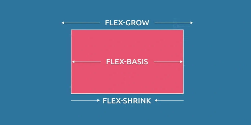
Items grow, shrink and basis using flexbox
flex-grow: This property is used to specify how the available additional space will be distributed among the flex items. It takes a numeric value that represents a proportion of the additional space that the flex item will receive relative to the others within the same container. If all flex items have a flex-grow value equal to 1, the available space will be divided equally among them. If one flex item has a value of 2 and another has a value of 1, the former will occupy twice as much additional space as the latter.
flex-shrink: This property controls how flex items are reduced in size when the container does not have enough space to display all items at their original size. Like flex-grow, it takes a numeric value and defines the proportion in which a flex item will shrink relative to the others. If one flex item has a flex-shrink value equal to 1 and another has a value of 2, the former will shrink at half the rate of the latter when necessary.
flex-basis: This property sets the initial size of a flex item before additional space is distributed or flex-shrink is applied. It can be set as a fixed value (e.g., in pixels) or as a percentage of the container size. If not specified, the browser will automatically set an initial size based on the contents of the flex item.
Using flexbox knowledge to style a story page.
Here we have two classes, .menu y .contentrepresenting flex containers with different configurations:
.menuIn this case, the abbreviated property "flex" with the values "0 0 80px" is used. This means that the elements inside.menuwill not expand or shrink (flex-grow: 0 and flex-shrink: 0), and will have an initial size of 80 pixels (flex-basis: 80px)..content: Here, the shorthand property "flex" is set to "1 1 200px". This indicates that the elements within.contentwill expand and shrink as needed (flex-grow: 1 and flex-shrink: 1), and will have an initial size of 200 pixels (flex-basis: 200px).
The shorthand property "flex" combines the three properties flex-grow, flex-shrink and flex-basis in one place, in that order. Each value corresponds to a property, and comments in the code show what the broken-down version of each rule would look like.
In summary, .menu will have a fixed size of 80 pixels and will not expand or shrink, whereas .content will occupy all available space in the parent container and will be adjusted as needed.
					.menu {
 background-color: #D9E8FB;
 // flex-grow: 0;
 // flex-shrink: 0;
 // flex-basis: 80px;
 flex: 0 0 80px;
}

.content {
 background-color: #FBF4F0;
 // flex-grow: 1;
 // flex-shrink: 1;
 // flex-basis: 200px;
 flex: 1 1 200px;
}

.section {
 padding: 10px;
}

.container {
 display: flex;
}

a {
 display: inline-block;
 padding: 5px;
}

h3 {
 text-align: center;
}
					<!doctype html>
<html>
  <head>
    <link rel="stylesheet" href="style.css" />
  </head>
  <body>
    <h3>Stories for Kids</h3>
    <div class="container">
      <div class="section menu"> <a href="#">Home</a><br><a
          href="#">Bedtime</a><br><a href="#">Humor</a><br><a href="#">Poems</a>
      </div>
      <div class="section content">
        <p>A long time ago in a land far away, in the Kingdom of Tazanah, there
          used to be a family of three.</p>
        <p>One early morning when the birds were chirping and singing sweetly
          the father of the family woke up and went to open the gate.</p>
      </div>
    </div>
  </body>
</html>
Using Flexbox to create a dynamic web page for a band.
Here we have several rules that use flex properties to control the layout of the elements:
#albumThis element is a flex container with the following properties:align-items: centerThe flexible elements within the#albumwill be aligned vertically in the center.display: flex: Establishes#albumas a flex container.flex-direction: rowThe flexible elements within the#albumwill be placed in a row.flex-wrap: wrapIf the flexible elements do not fit in a single row, they will be wrapped in additional rows.justify-content: space-aroundFlexible elements shall be distributed with equal space around them along the main axis (horizontal in this case).align-content: space-aroundThe content will be distributed with equal space around the rows along the secondary axis (vertical in this case).
#songlistAnother flex container with the following properties:height: 150pxThe container will have a height of 150 pixels.display: flex: Establishes#songlistas a flex container.flex-direction: rowThe flexible elements within the#songlistwill be placed in a row.justify-content: space-betweenThe flexible elements will be distributed with space between them along the main axis (horizontal in this case).flex-wrap: wrapIf the flexible elements do not fit in a single row, they will be wrapped in additional rows.
#description: It is an element inside the flex container#albumthat has the propertyflex: 1 0 250px;. This means that this element will expand to occupy all available space in the container along the main (horizontal) axis, but will not shrink if there is less space than necessary. Its initial size is 250 pixels..bonusThis class is not present in any element in the provided code. Apparently, it is a style rule that does not apply anywhere.
					body {
  background: linear-gradient(90deg, #ABC6CC, #DBE6F6);
  font-family: 'Gill Sans', sans-serif;
  font-weight: 100;
}

.song {
  border: 1px solid gray;
  padding: 10px;
  border-radius: 5px;
  height: 20px;
  background-color: #DFE6E9;
  color: black;
  font-size: 10px;
}

#album {
  height: 400px;
  margin-top: 50px;
  margin-bottom: 50px;
  align-items: center;
  display: flex;
  flex-direction: row;
  flex-wrap: wrap;
  justify-content: space-around;
  align-content: space-around;
}

#album img {
  height: 100px;
  width: 100px;
  border-radius: 10px;
  border: solid 5px white;
}

#songlist {
  height: 150px;
  display: flex;
  flex-direction: row;
  justify-content: space-between;
  flex-wrap: wrap;
}

#description {
  margin-left: 20px;
  margin-right: 20px;
  flex: 1 0 250px;
}

#album-metadata {
  margin-left: 10px;
  margin-right: 10px;
}

.bonus {
  flex-grow: 1;
}
					<!doctype html>
<html>
  <head>
    <title>The Programmers - New Album!</title>
    <link rel="stylesheet" href="style.css">
  </head>
  <body>
    <div id="album">
      <img decoding="async" src="https://mimo.app/i/mountains.png">
      <div id="album-metadata">
        <h3>!false</h3>
        <h5>by The Programmers</h5>
        <h6>Released On: September 3rd, 2021</h6>
      </div>
      <p id="description"> In their fifth studio album, "!false" (literally,
        (literally, "not false"), the Programmers deliver a spectacular performance, from
        synth beats to awe inspiring vocals. They write about their journey
        through life, their trials, and their tribulations. Listeners should
        look forward to their next project together! </p>
    </div>
    <div id="songlist">
      <div class="song">Track 1</div>
      <div class="song">Track 2</div>
      <div class="song">Track 3</div>
      <div class="song">Track 4</div>
      <div class="song">Track 5</div>
      <div class="song bonus">+15 bonus tracks</div>
    </div>
  </body>
</html>
Using CSS Flexbox Grow, Shrink and Basis to create 2 navigation variations
Here we have several rules that use flex properties:
.navbarFlex Container: It is a flex container due to the propertydisplay: flex;..one .mail,.one .phone,.one .home,.one .searchare elements within the.navbarthat have different values offlex-growwhich controls how the additional available space is distributed between these elements within the.navbar..two .home,.two .search,.two .phone,.two .mailare elements within the.navbarbelonging to another group with class.two. These elements also have values offlex-growand/orflex-basisdefined.
.one .mail,.one .phone,.one .home,.one .searchhave values offlex-growto adjust its relative size on the main axis (horizontal by default) within the group.one..two .homehas aflex-grow: 4and will outgrow the elements.one .homeon the main axis..two .searchhas an abbreviated propertyflexwith values0 0 100pxwhich means that it will not grow or shrink and will have an initial size of 100 pixels on the main axis..two .phoney.two .mailhaveflex-basiswhich sets its initial size to 50 pixels on the main axis.
The property flex-grow determines how the flexible elements will be distributed in the available space, whereas flex-basis sets its initial size before it is applied flex-grow.
					.navbar {
  display: flex;
}

.one .mail {
  flex-grow: 1;
}

.one .phone {
  flex-grow: 1;
}

.one .home {
  flex-grow: 2;
}

.one .search {
  flex-grow: 3;
}

.two .home {
  flex-grow: 4;
}

.two .search {
  flex: 0 0 100px;
}

.two .phone {
  flex-basis: 50px;
}

.two .mail {
  flex-basis: 50px;
}
					body {
 font-family: sans-serif;
 background-color: #84adadad;
 color: white;
}

h6 {
 margin-top: 10px;
 margin-bottom: 10px;
}

h1,
h2,
h3,
h4 {
 text-align: center;
}

p,
ul {
 margin-left: auto;
 margin-right: auto;
 max-width: 500px;
 font-size: 20px;
 font-style: italic;
 text-align: center;
}

.one *,
.two * {
 border-radius: 8px;
 height: 30px;
 display: table-cell;
 justify-content: center;
 vertical-align: middle;
 line-height: 30px;
}

input {
 min-width: 0;
 border-radius: 8px;
 padding: 0 5px;
}

.navbar {
 width: auto;
 height: 40px;
 padding: 2px;
 align-items: center;
 border: 2px solid white;
 text-align: center;
 border-radius: 8px;
 padding-left: 5px;
 padding-right: 5px;
}

.content {
 height: 500px;
 flex-direction: column;
 justify-content: center;
 align-items: center;
}

.content * {
 margin: 0;
}

.list-header,
.tagline {
 border: 1px solid white;
}

.list-header,
.tagline,
.list {
 width: 100%;
}

.tagline {
 margin-top: 20px;
}

.hidden {
 display: none;
}

img {
 display: block;
 margin-left: auto;
 margin-right: auto;
 height: auto;
}
					<!doctype html>
<html>
  <head>
    <script src="index.js"></script>
    <link rel="stylesheet" href="./style.css" />
    <link rel="stylesheet" href="./index.css" />
  </head>
  <body>
    <select id="selection" onchange="switchNavbar()">
      <option value="option1">Option 1</option>
      <option value="option2">Option 2</option>
    </select>
    <h1>Kyle's Bakery</h1>
    <div id="option1">
      <div class="navbar one">
        <span class="mail">
          <img decoding="async" src="https://mimo.app/i/mail-large.png" height="10" />
        </span>
        <span class="phone">
          <img decoding="async" src="https://mimo.app/i/phone-large.png" height="10" />
        </span>
        <span class="home">Home</span>
        <input class="search" type="text" placeholder=" Search ">
      </div>
    </div>
    <div id="option2" class="hidden">
      <div class="navbar two">
        <span class="mail">
          <img decoding="async" src="https://mimo.app/i/mail-large.png" height="10" />
        </span>
        <span class="phone">
          <img decoding="async" src="https://mimo.app/i/phone-large.png" height="10" />
        </span>
        <span class="home">Home</span>
        <input class="search" type="text" placeholder="search">
      </div>
    </div>
  </body>
</html>
					function switchNavbar() {
  const input = document.getElementById("selection").value;
  if (input == "option1") {
    document.getElementById("option1").classList.remove("hidden");
    document.getElementById("option2").classList.add("hidden");
  } else {
    document.getElementById("option2").classList.remove("hidden");
    document.getElementById("option1").classList.add("hidden");
  }
}
Using Flexbox Items knowledge to create a conference schedule
And finally we have several rules that use flex properties:
#wrapperThe main container used bydisplay: flex;which makes it a flex container.#times: It is a flex container that has an initial size of 100 pixels in the main axis due toflex-basis: 100px;. In addition,flex-direction: column;sets the direction of the main axis to vertical, which will cause the elements inside the#timesare placed in a column.flex-grow: 0;prevents#timesgrow on the main axis, andflex-shrink: 0;prevents shrinkage.#times pIt is an element within#timeswhich hasflex-grow: 1;This means that it will grow to occupy all available space on the main axis.#eventsAnother flex container that also hasflex-direction: column;by placing the elements inside#eventsin a column.flex-grow: 1;allows#eventsgrow on the main axis to occupy all the available space, andflex-shrink: 1;allows it to shrink if necessary.#events pIt is an element within#eventswithflex-grow: 1;This allows it to grow and occupy all the available space in the main axis.
In short, the container #wrapper contains two sections, #times y #eventsplaced in a vertical column. #times has an initial size of 100 pixels, and #events will expand to occupy the remaining available space. Both the elements <p> within #times as those of #events will expand to occupy all available space on the main axis.
					#wrapper {
  display: flex;
}

#times {
  display: flex;
  flex-basis: 100px;
  flex-direction: column;
  flex-grow: 0;
  flex-shrink: 0;
}

#times p {
  flex-grow: 1;
}

#events {
  display: flex;
  flex-direction: column;
  flex-grow: 1;
  flex-shrink: 1;
}

#events p {
  flex-grow: 1;
}
					#body {
  text-align: center;
  color: white;
  font-family: sans-serif;
  height: auto;
}

h2 {
  color: #34495E;
}

#wrapper {
  border: 1px solid black;
  height: 400px;
  margin: 1%;
  padding: 2%;
}

#times {
  background-color: #34495E;
}

#events {
  background-color: #7D3C98;
  padding: 10px;
}
					<!doctype html>
<html>
 <head>
		<script src="index.js"></script>
  <link rel="stylesheet" href="./index.css" />
  <link rel="stylesheet" href="./style.css" />
  <title>Conference Schedule</title>
 </head>

 <body>
  <div id="body">
   <h2>Conference Schedule</h2>
   <div id="wrapper">
    <div id="times">
     <p>8:30 - 10:00</p>
     <p>10:15 - 11:45</p>
     <p>12:00 - 1:00</p>
     <p>1:00 - 3:00</p>
     <p>3:15 - 5:00</p>
    </div>
    <div id="events">
     <p>Breakfast</p>
     <p>Seminar 1: Your Marketing Toolbox</p>
     <p>Lunch</p>
     <p>Seminar 2: Customer Acquisition for the Modern Web</p>
     <p>Seminar 3: Search Engine Optimization Best Practices</p>
    </div>
   </div>
  </div>
</body>
</html>


